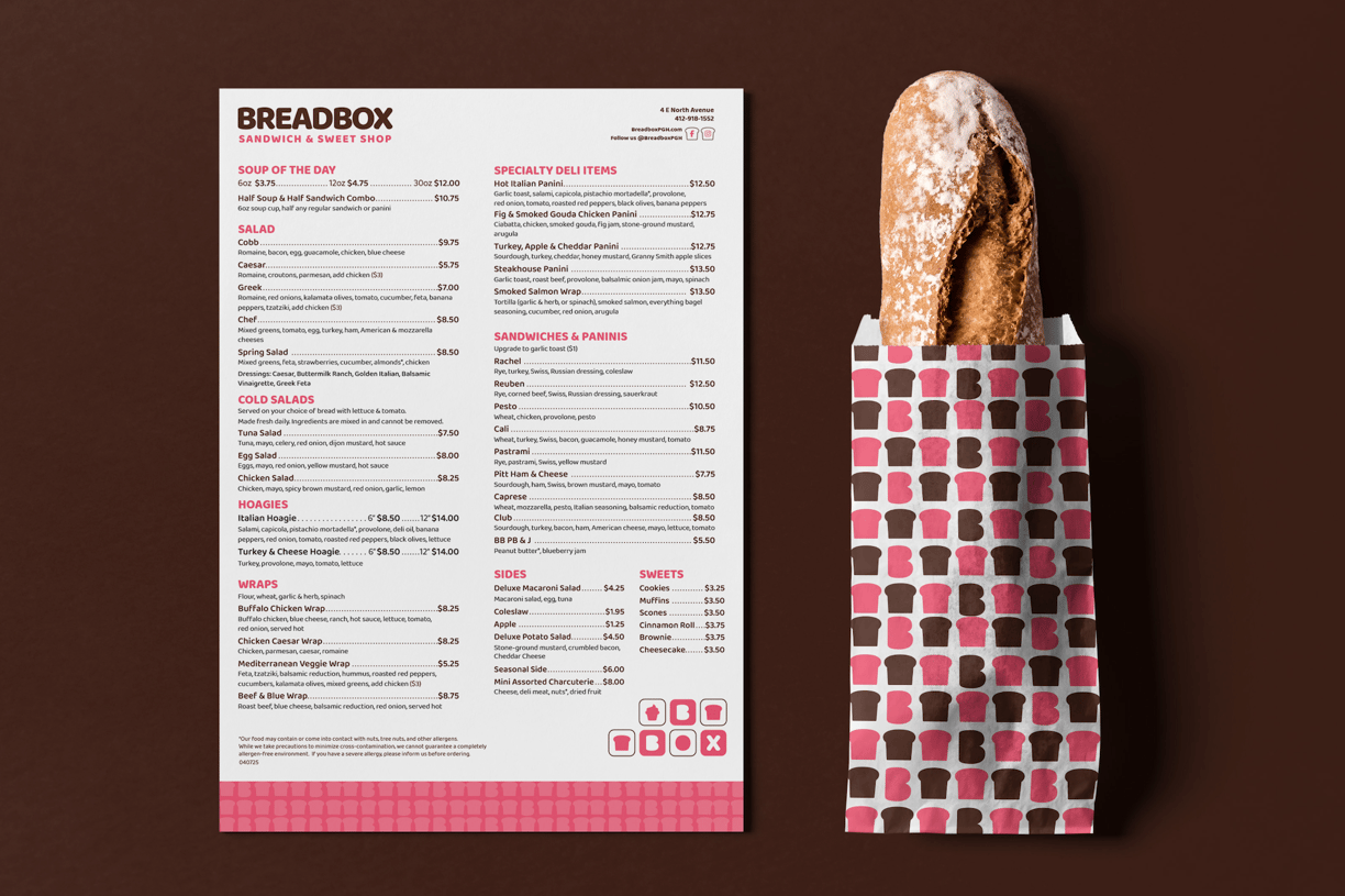
Breadbox Sandwich & Sweet Shop
A modern, feminine take on the classic corner sandwich shop.
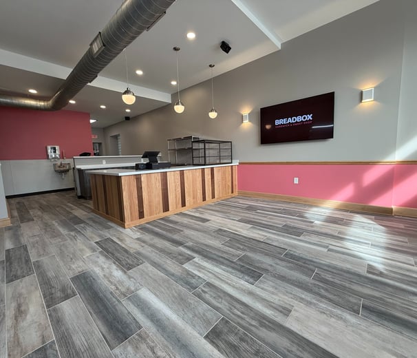
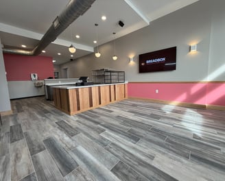
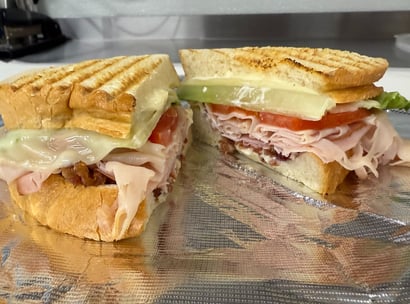
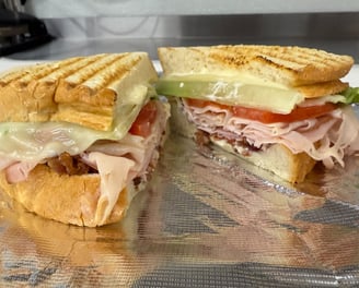
Designed to feel approachable, local, and lovingly homemade, Breadbox combines a clean, modern aesthetic with soft, welcoming details to reflect its identity as a small business rooted in community. From the hand-crafted sandwiches to the sweet treats behind the counter, every element was created to feel thoughtful and inviting — a reflection of the care that goes into every order. This project included branding, signage, and environmental design aimed at striking a balance between neighborhood charm and fresh, contemporary style.
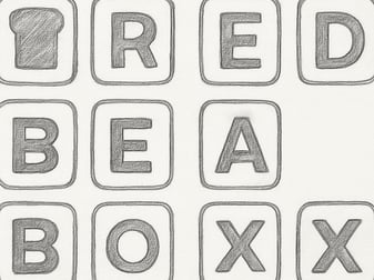
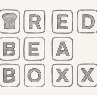
Simple, Bold Identity
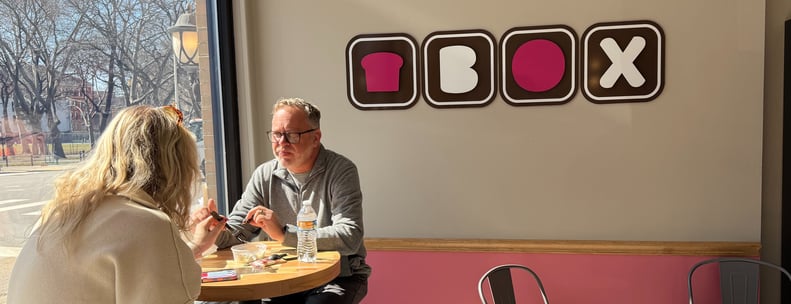
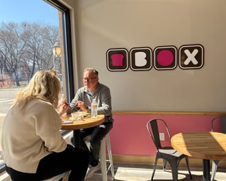
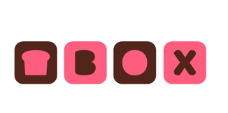
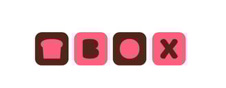
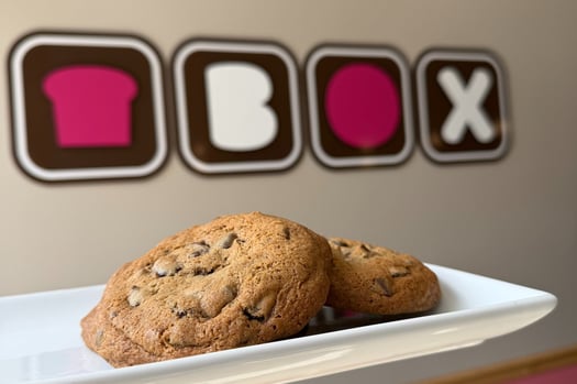
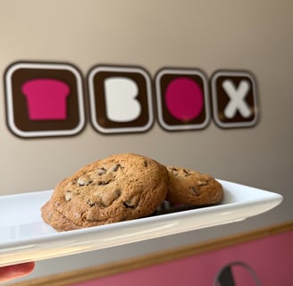
The secondary Breadbox logo was created using basic geometric forms — rounded squares and minimal letterforms — to build a playful yet structured mark. Each character is housed in its own soft-cornered square, with a stylized slice of bread standing in for the “B.” This modular design reinforces brand recognition while offering flexibility across signage, packaging, and social media — all while maintaining a clean, modern look that feels friendly and fresh.
Soft Shapes with a homemade feel.
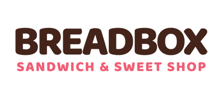
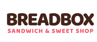
The main Breadbox logo uses bold, rounded letterforms that feel soft, approachable, and slightly playful — a nod to the warmth and comfort of a neighborhood bakery. The simplicity of the type, paired with its subtle “fluffiness,” evokes the texture of fresh-baked bread and the inviting atmosphere of the shop. This logo was designed to be friendly and memorable, capturing the essence of a place that serves homemade sandwiches and sweets with a personal touch.

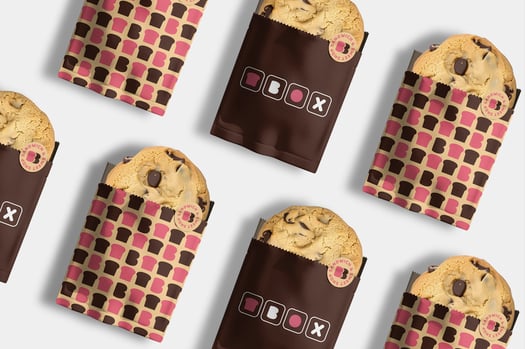
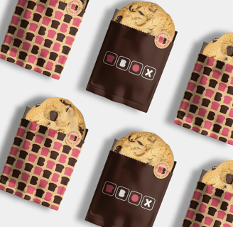
Small but Mighty
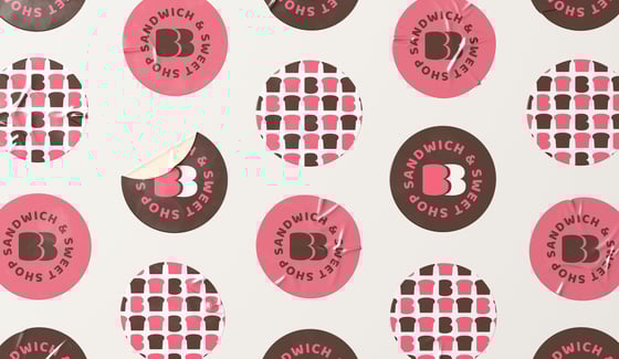
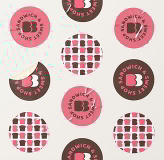
The round Breadbox logo serves as a versatile brand mark used across packaging and digital platforms. It’s featured on stickers to seal sandwich wrappers and dessert bags, adding a sweet finishing touch that reinforces the brand’s personality. Its bold, circular shape and simple iconography also make it the perfect fit for social media — easily recognizable and scalable, whether on an Instagram profile or printed on a to-go bag.


Friendly, and Fresh
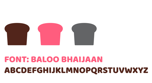
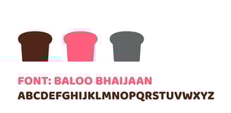
The primary typeface, Baloo Bhaijaan, was selected by Joe Zeff for its rounded, playful letterforms that bring warmth and personality to the Breadbox brand. Its bold structure strikes a balance between approachability and confidence — perfect for a neighborhood shop that feels both familiar and fresh. The color palette of rich brown, bold pink, and muted grey adds a modern, feminine touch that sets Breadbox apart.